Laughable Christmas Decorations That Must Have Been Designed By Comedians
Advertisement
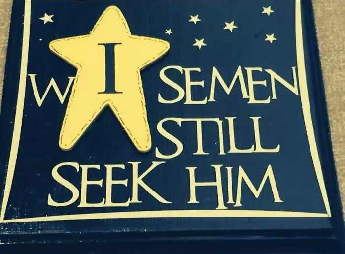
The Three Wise Men Are Still On The Search
Graphic design teaches about things like kerning and just how important it is. Kerning is basically the spacing between letters, and while it may appear to be something intuitive it is anything but. Some logos look better with larger spaces, some smaller, and sometimes the kerning is even different for each word in promotional material. This sign is a victim of bad kerning. At first glance, the "I" in the star does not appear to be connected to any words.
Reddit
That "I" actually belongs to the word, "wise" but instead it looks like the "W" is all alone, and there is another word that should definitely not be associated with Christmas just hanging out.