Interesting Maps That Show a Different Perspective of the World
Advertisement
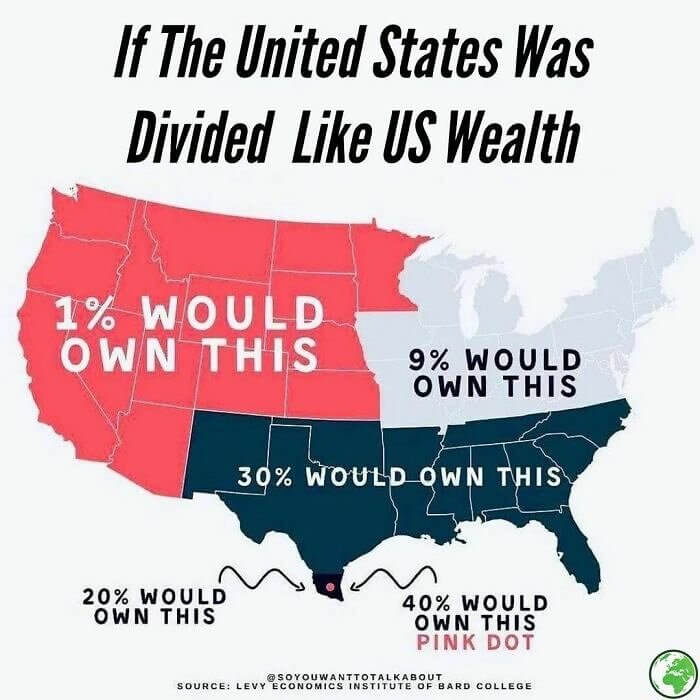
If Us Wealth Was Distributed
It's funny to think of how wealth is distributed among different populations of society. In the US, the distribution of wealth is displayed on this map, how it would actually be if things were divided among land. You can see how much land 1% of the population would control (compared to how much money 1% of the population in the US has). And then compare that to the 40% owned by the pink dot that is barely visible.
mapcentral
It's sort of scary to see the distribution of wealth displayed like this. It shows how uneven it is in the US, despite most people thinking it is a wealthy country.