Maps That Show How The World Really Is
Advertisement
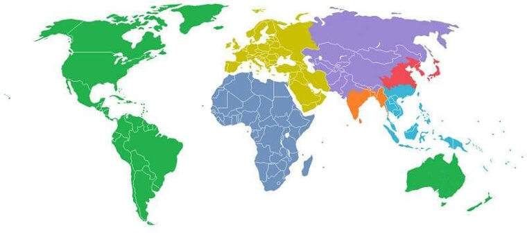
Reaching 1 Billion
With over 7 billion people on this planet, it is hard to conceptualize that most of that population is situated in Asia, Africa, and South America. To detail this, take a look at this color-coded map. Each color shows how the world's populations combine to reach 1 billion people in specific regions. For example, it would take North America, South America, and Australia to reach 1 billion people.
Reddit / Delugetheory
India and China have one billion people apiece, with Africa, Europe combined with the Middle East, parts of Asia, and Oceania making up the rest. That is a lot of people for Mother Earth to support.