Weird And Interesting Maps That Depict The World Differently
Advertisement
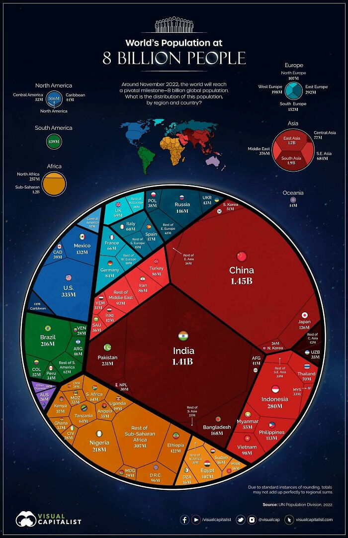
Visualizing The World's Population
As far as maps go, this one is pretty unique. It's a visualization of the world's population divided up by location. So, it allows you to see how many people are on each continent and in what countries those people live. Unsurprisingly, Asia contains the majority of the world's population. However, India isn't as far behind China as we thought they were. The Oceania region also has much fewer people than we thought.
Reddit
The U.S. and Mexico account for the majority of North America's population, while a handful of European countries dwarf their neighbors when it comes to the number of people living there.