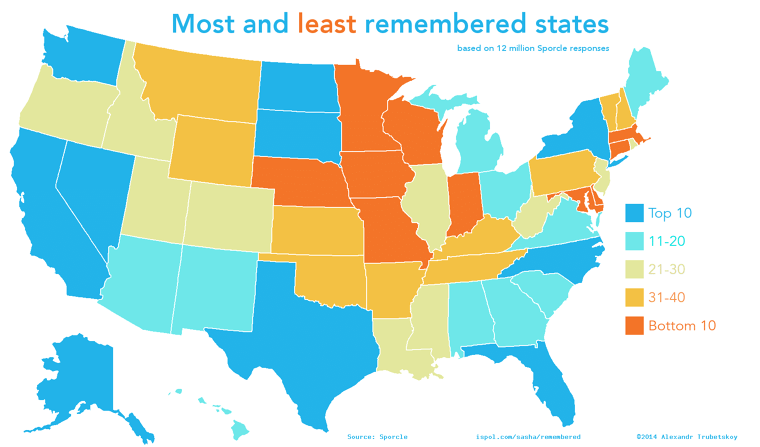
Maps That Show How The World Really Is
Advertisement
A World Map To Scale
With so many maps not drawn to scale, it is time to look at one that accurately represents what countries' landmass actually looks like. The Hobo-Dyer Equal Area Projection team produced this map which shows just how big continents and countries are in relation to one another.
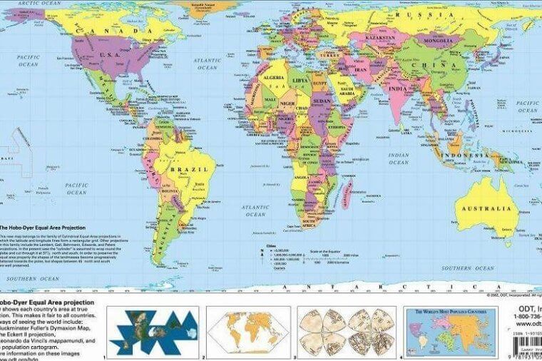
Hobo-Dyer Equal Area Project Map
Africa is much bigger than it is normally shown, which is important as it is becoming an economic powerhouse, and is undergoing massive population growth. The United States is also much smaller than it normally appears, which is important because while it is economically important, it is not the largest by landmass.